

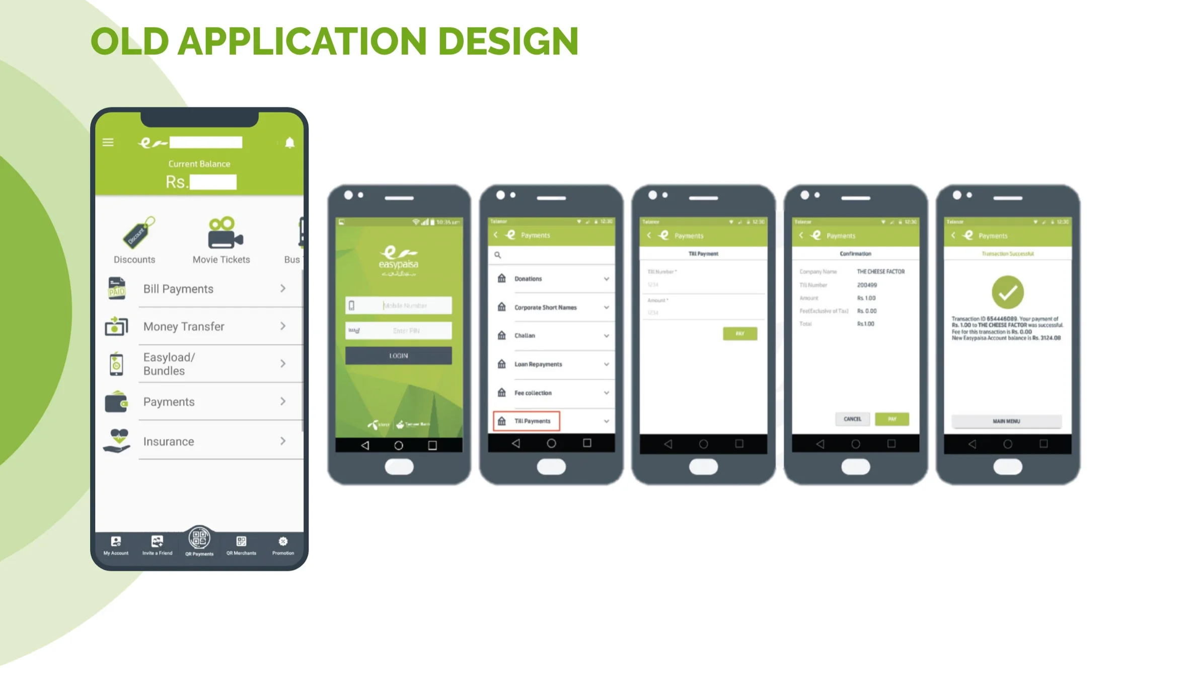
Challenge
Simplify complex financial operations for users with varying levels of digital literacy while maintaining security and trust

Solution
Created an intuitive, accessible user experience interface with clear information architecture, progressive disclosure, and localized design patterns

Impact
45% increase in user engagement, 60% reduction in transaction errors, and 4.5+ star rating on app stores
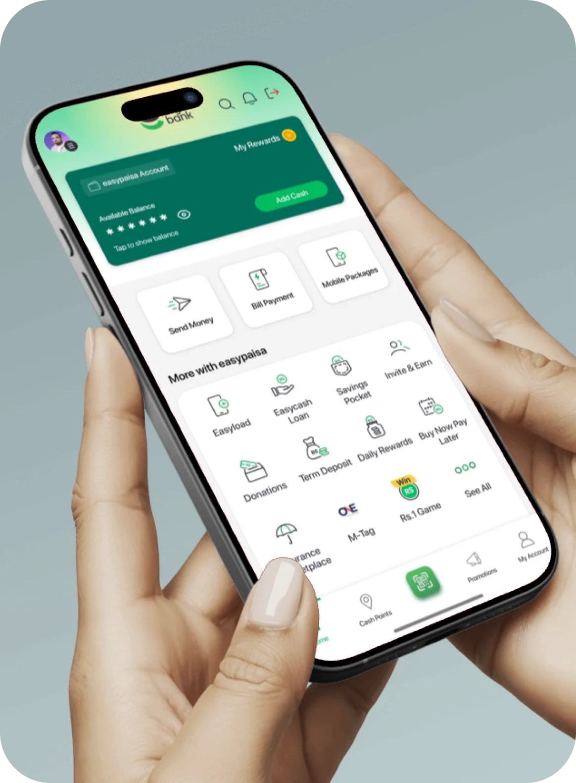
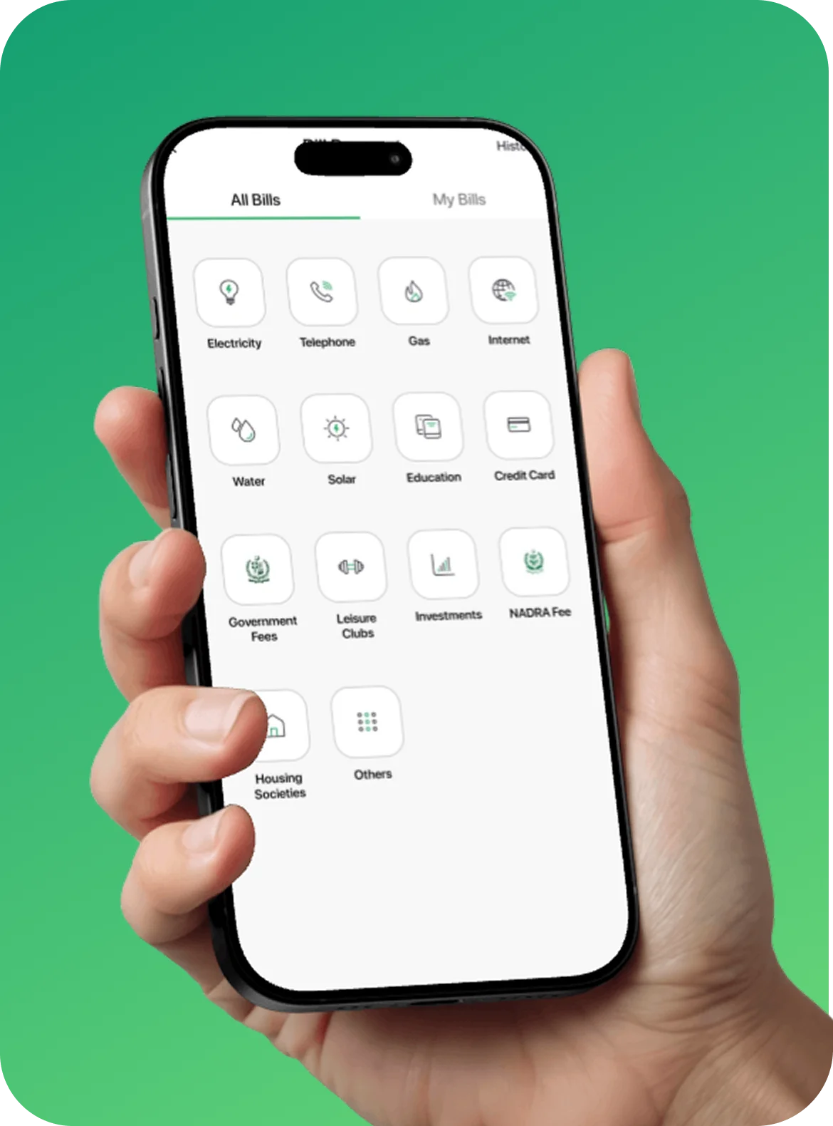


Visual Design

Interactions & Animations

Accessibility

Localization